Transitions and polish
Hello all!
Welcome to the Pedestrian’s monthly update showcasing another month's worth of progress. Since our last update, we’ve focused on the “transition” areas, meaning the train and elevators. We wanted to make sure they were not only functional, but also visually pleasing. Loading and unloading areas in a seamless and hopefully unnoticeable way. We’ve also been finalizing some of our unfinished assets (mostly in the InnerCity area) and worked on a couple new systems. So without further ado, here’s what happened last month, enjoy!
Twitter - Facebook - Steam Wishlist
- Continued to enhance the different hub’s functionality by adding some wires and calculators. Each of these hubs have to be completed in order to access the next area.
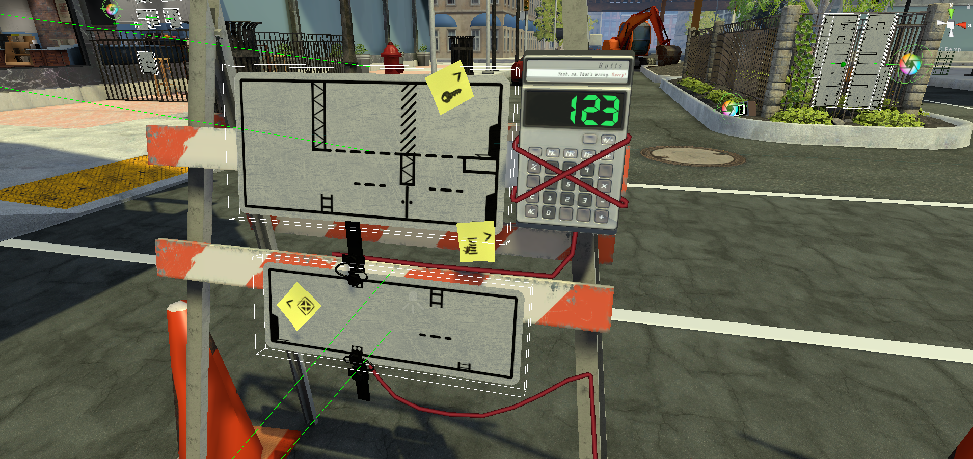
- In The Pedestrian we are trying to avoid pop up GUIs at all costs, we feel that sometimes they are overused and distracting. So in order for us to have an options menu, we’ve placed them on displays spread throughout the game world. At any point in the game when you hit the ESC key, the camera will fly over to the nearest display and show all the lovely options.
- Worked on a mechanism to force the game into a 16:9 aspect ratio
- Added the ability to change graphics settings into the options menu
- The rooftop area’s hub now functions, transporting you to the different sections of the area.
- We worked on the train, making it move between the areas to continue our goal of uninterrupted gameplay.
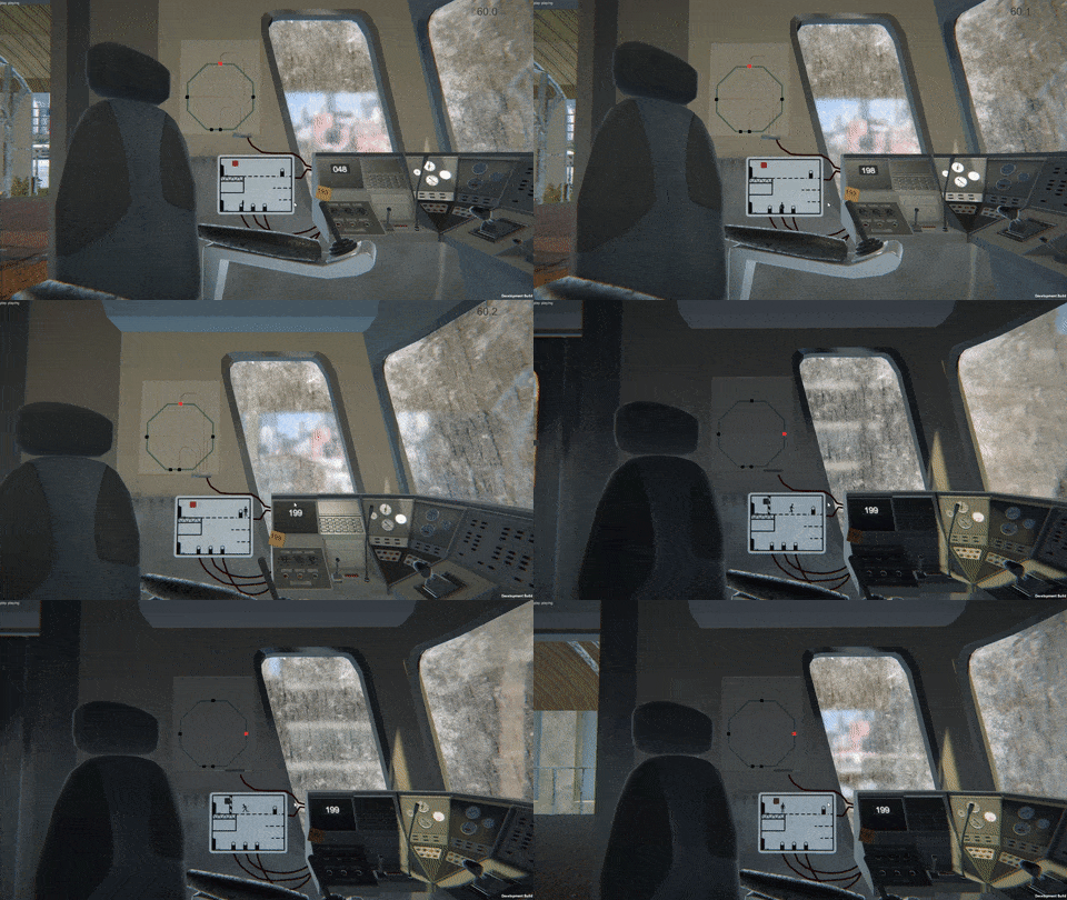
- Similar to the train, we worked on the elevators to remain as functionally fluid as possible and made it look good.
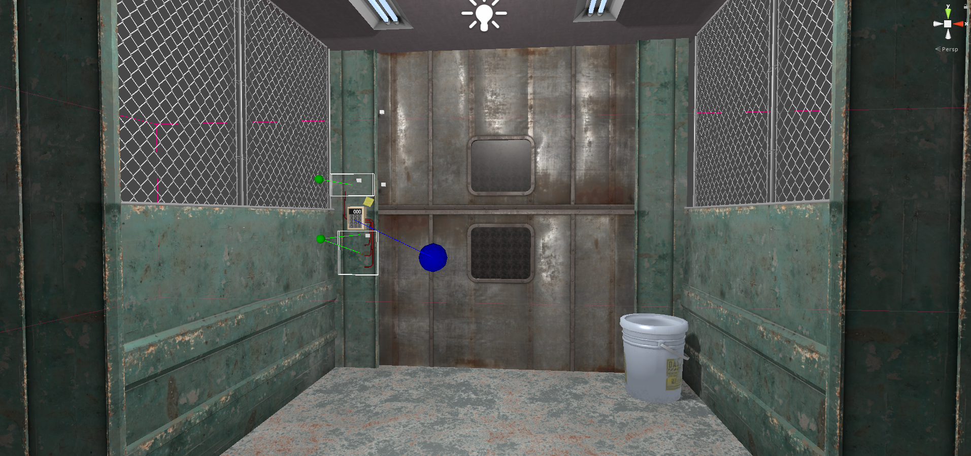
- We are refining our area lightmaps, always working towards getting the color palates interesting, while keeping it realistic.
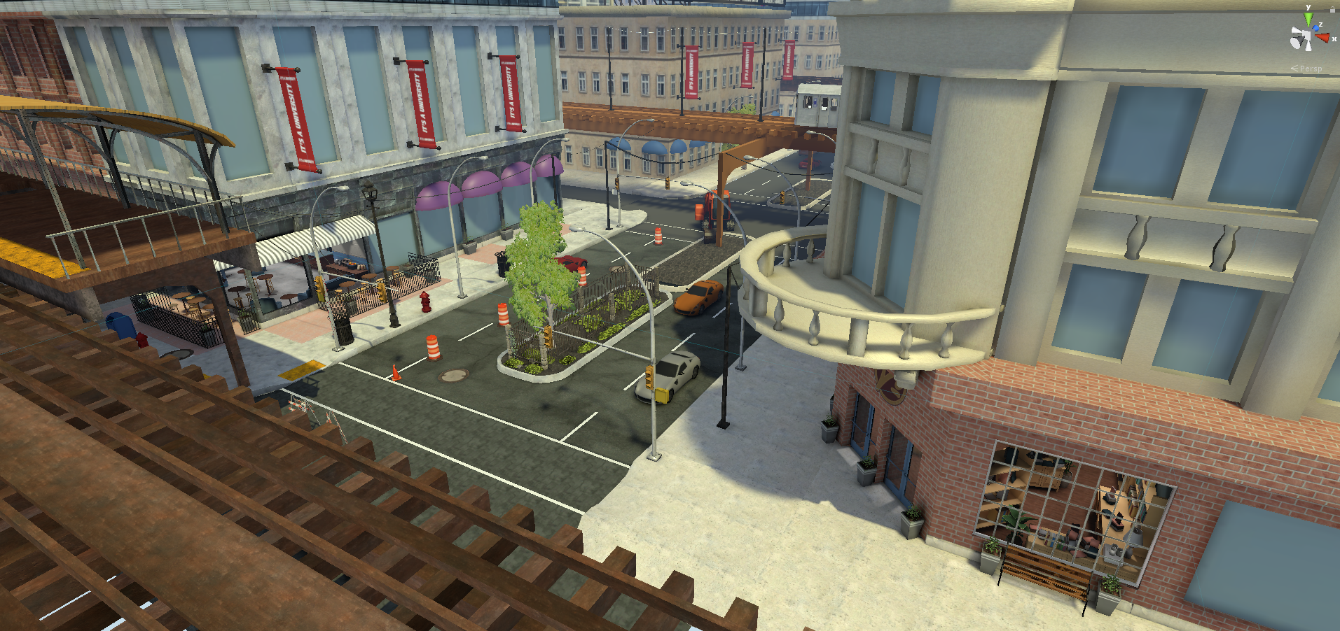
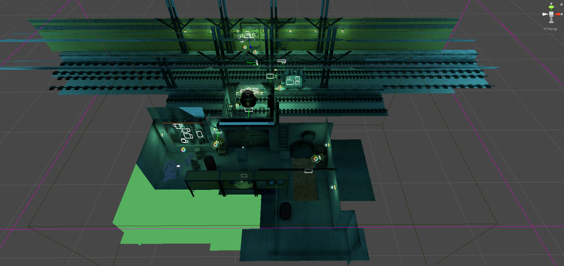
- Blocked out the finale area. The goal is to keep this area as practical as possible so that it doesn’t add too much to the development time.
- Removed a few unliked puzzles and brought in better ones to fill the holes. This removed the need for an area. We combined the construction area with the finale and rooftops.
- The InnerCity had quite a few placeholder props that we worked on finalizing. This helped flush out the area.
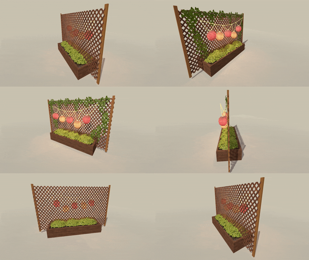
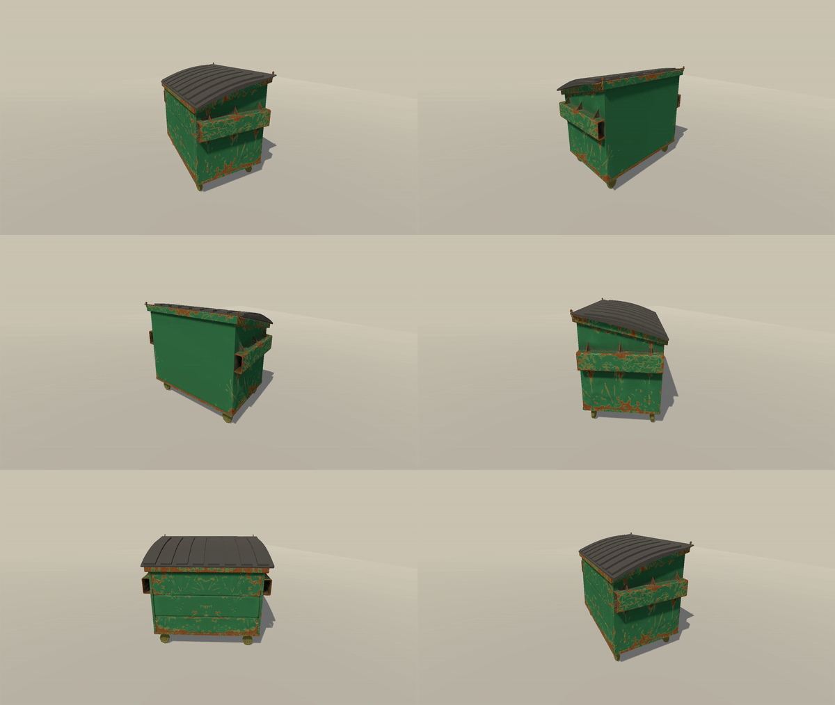
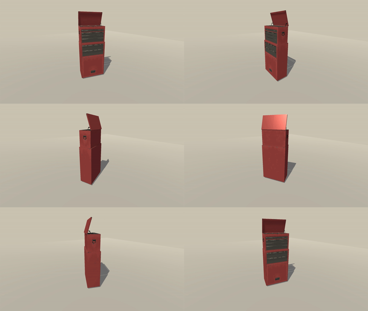
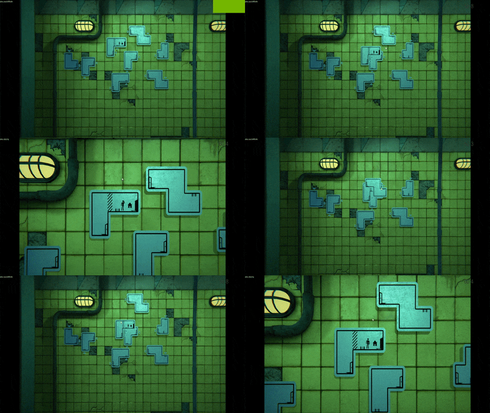
- We improved the way that certain information is displayed to the player. In the past when signs were overlapping we had some flashy outline as well as a popup that showed our overlapping symbol. Like I mentioned earlier, we want to avoid pop ups so now we are using colors to communicate these ideas.
This month has been pretty big for us. Our morale has been high, tasks were concise and completable, and we’ve refrained from adding anything. We’ve been focused on checking off some items that haven’t had much attention, namely the train, elevator, and options menus. Overall, progress was made! Thank you for your continued patience and support, we’ll see you next month!
Get The Pedestrian (Demo)
The Pedestrian (Demo)
Enjoy this textless journey, where all ideas are shared in icons and your powers of observation will be put to the test.
| Status | In development |
| Author | Skookum Arts |
| Genre | Platformer |
| Tags | Puzzle-Platformer, Side Scroller, Singleplayer |
More posts
- The Pedestrian is now available!Jan 29, 2020
- Christmas Special UpdateDec 21, 2019
- The Pedestrian - Official Release Date TrailerNov 30, 2019
- Special Secret Announcement and October UpdateOct 21, 2019
- Settings, Signs, and Store Page UpdateSep 20, 2019
- August Update!!Aug 21, 2019
- Start of Summer Mid Beta Update!Jun 20, 2019
- Beta testingMay 21, 2019
- Post Easter UpdateApr 22, 2019
- Optimization, Animation, and Navigation.Mar 22, 2019
Leave a comment
Log in with itch.io to leave a comment.